
Coping with Oscilloscope Signals
Published:
finally I can spell oscilloscope correctly
Long in short: A simple method to smoothen DC data. Worked perfectly for gate transfer curves.
Much frustration from Columbia EE labs – no prof, no TA, no good handout, just self-study the techniques.
More unfortunately, labs don’t always go smoothly as you think they would. You often end up with crappy data from the oscilloscope. Maybe it’s a scope probe issue; maybe it’s just noise; who knows?
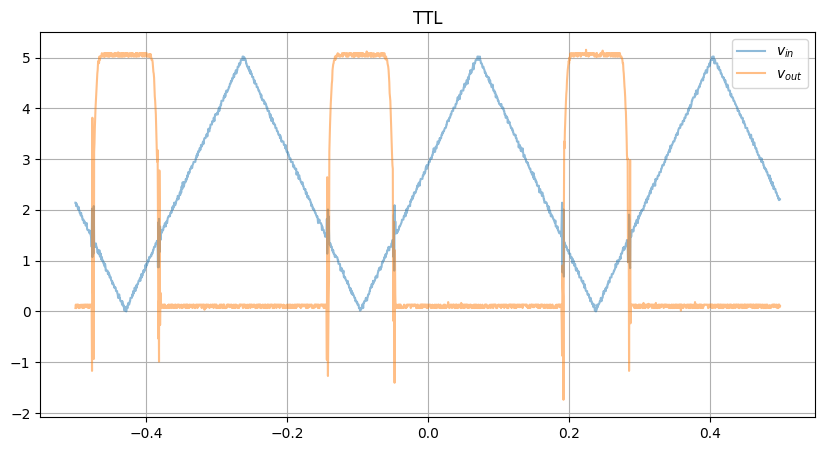
Here’s DS lab 1 part 1. The task was seemingly simple: find the transfer curve of a TTL NAND gate by sweeping a triangular wave as the input
Wires up, supplies on, and boom! Here was our raw data:
Looks… like an input-output response, but if you take the XY plot…
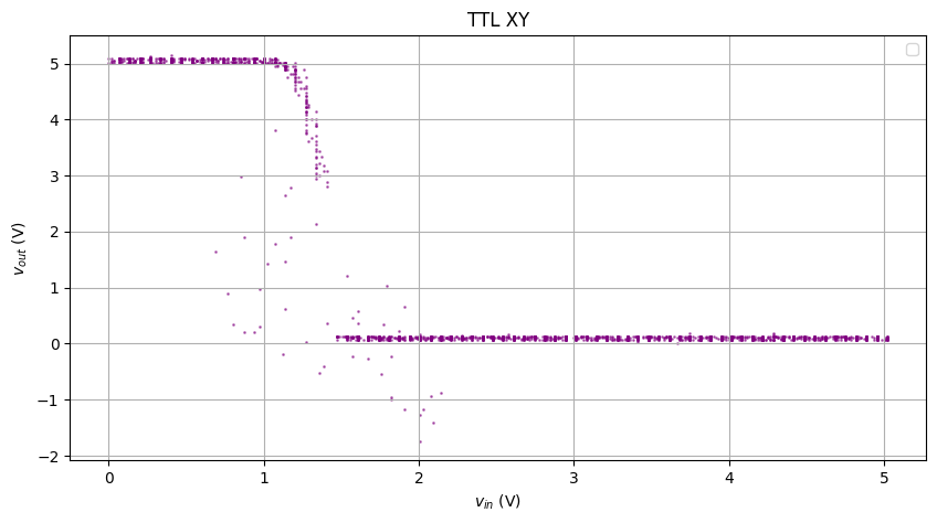
Hmm… looks like some gas particle diffusion
Before you start
- Make sure your analysis is something close to DC. Can’t do an FT here..
- Make sure the csv is captured under the oscilloscope’s “time” mode with the appropriate scale. The XY mode will not capture the whole scene
- Make sure you amplify the data back if you’re using the 10x probe
- Make sure to filter out the
NaNvalues:t = t[~(np.isnan(x) | np.isnan(y))]
KNN Smoothing
Before KNN, I tried various methods, such convolution and Gaussian smoothing, but the data seemed to oscillate beyond the window of interest.
- It will be great if someone can teach me how to properly do that
The idea of KNN is: for each point, find and average its K Nearest Neighbors. Scipy has a package to conveniently create and find the neighbors.
Time axis
Let’s first smooth x and y with their neighbors in the t axis only
- I chose
k = 20
from scipy.spatial import KDTree

def smooth_data(t, x, k=20):
    # Reshape the time axis to 2D and create a tree for KNN search
    tree = KDTree(t.reshape(-1, 1))
    smoothed_x = []

    for ti in t:
        _, idx = tree.query([ti], k=k+1)
        # Take the avg
        smoothed_x.append(np.mean(x[idx]))

    return np.array(smoothed_x)

x_smooth = smooth_data(t, x)
y_smooth = smooth_data(t, y)
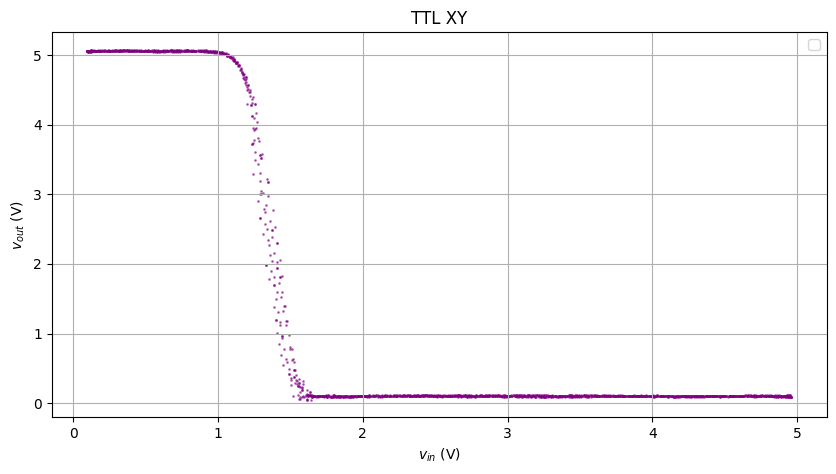
Damn the result was awesome!
XY plot
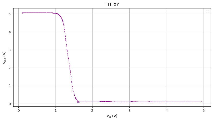
The plot above was good enough for analysis. To make it better, we’ll do KNN on each point of the XY plot.
Let’s smoothen it more via KNN on the x and y axes. Now we’re manipulating the XY plot.
k = 20

points = np.vstack((x_smooth, y_smooth)).T
tree = KDTree(points)

x_smooth_2 = np.zeros_like(x_smooth)
y_smooth_2 = np.zeros_like(y_smooth)

for i, point in enumerate(points):
    _, idx = tree.query(point, k=k+1)
    x_smooth_2[i] = np.mean(x_smooth[idx])
    y_smooth_2[i] = np.mean(y_smooth[idx])
Here’s what the data looks like after the second (XY) smoothening:
Now add the cursors to where slope = -1. I should have calculated the dy/dx and approximated where it’s -1, but why don’t we just 摆烂 and eyeball it
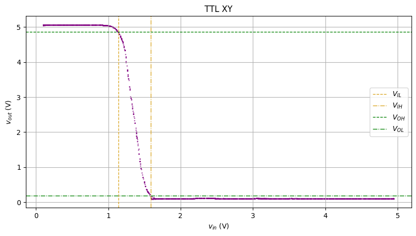
Looks pretty pretty! (and the graders don’t care if I 摆烂 or not)
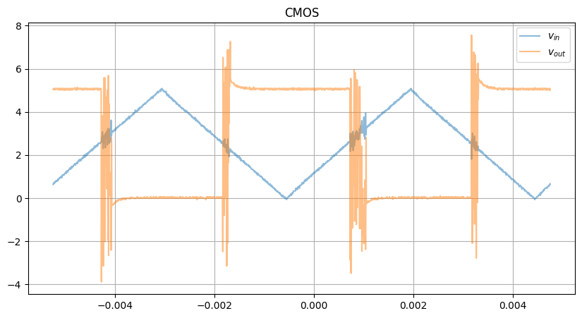
CMOS
The CMOS XY raw plot is even messier, due to the asymmetric rise/fall
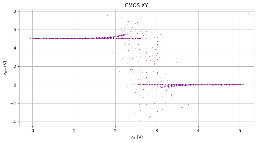
Completely broken.
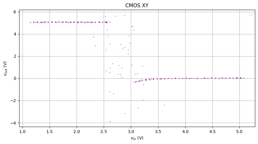
The figure above has superimposed multiple rises and falls with different behaviors, so I’ll create masks and only look at one specific rise and fall.
Feed the above to our KNN smoothener, and we get the result below:
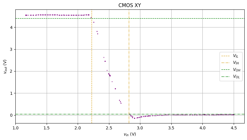
Not bad.